Plan New Outlet Locations Using Isochrone Analysis for Faster Delivery

Most restaurant chains and cloud kitchens still expand using a familiar playbook—look at demand clusters, check competition, and draw rough distance-based service areas. It works to an extent, but it misses a critical variable: how long delivery actually takes.
Two locations that are 5 km away can behave very differently. One might take 12 minutes, another 35. Roads, traffic, signals, and density change everything. Planning based on distance alone often leads to overestimated coverage and slower deliveries.
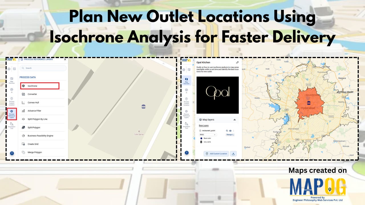
This is where isochrone analysis offers a more grounded approach. Using a platform like MAPOG, these time-based delivery zones can be generated and visualized directly on a map, alongside outlet locations and demand data.
What is isochrone analysis (and why it’s useful)
Isochrones map areas reachable within a specific time limit from a location. Instead of drawing circles, they shape themselves around real travel conditions.
For a restaurant, this means you can clearly see:
What falls within a 15–20 minute fast delivery zone
Which areas are reliably served within 30 minutes
Where delivery starts stretching into 40 minutes or more
This shift—from distance to time—makes planning far more aligned with how delivery actually works.
Why this matters for food delivery
In most Indian cities, delivery expectations sit around 30–45 minutes. That makes the 30-minute mark especially important.
If you map your outlets using isochrones, three patterns usually emerge:
15–20 minutes: High coverage, often overlapping outlets
20–30 minutes: Balanced and optimal
30–40 minutes: Demand exists, but delivery becomes slower
The interesting part isn’t where you’re strong—it’s where you’re almost good enough but not quite.
That “almost” zone is where expansion decisions start making sense.
How to actually use this for planning
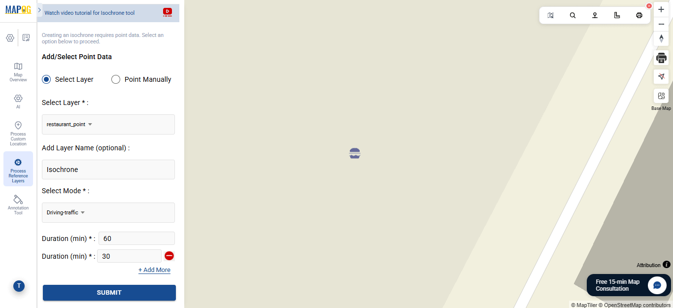
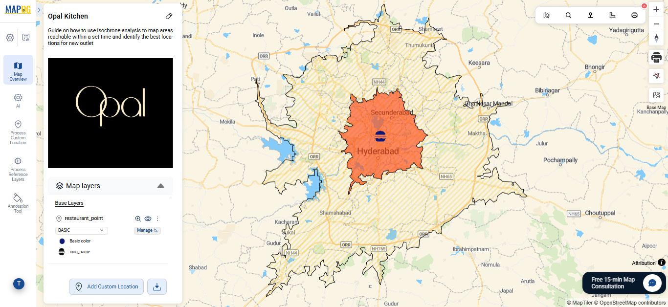
Start by plotting existing outlets and generating isochrone zones (15–20, 20–30, 30–40 minutes), then overlay demand data such as orders or population density. This helps reveal clear patterns—while the 15–20 minute zone is usually well served and the 20–30 minute zone remains stable, the 30–40 minute band often highlights unmet demand.
These areas indicate locations where customers exist but delivery times are stretching. Placing new outlets here not only expands coverage but also improves service quality in already active regions, helping optimize the network rather than expanding blindly.
Turning insight into something usable
Analysis is one part of the problem. The other is execution—figuring out how to act on these insights across teams.
When everything lives on a map, it becomes easier to:
See coverage and demand together
Mark potential outlet locations
Assign tasks like site surveys or feasibility checks
Track updates directly from the field
Teams don’t have to rely on scattered sheets or reports. Information stays tied to specific locations, which makes coordination simpler and decisions faster.
A small shift that makes a big difference
Isochrone analysis doesn’t require complex modeling—it’s a shift in perspective. Instead of asking “How far can we deliver?”, it asks “How fast can we deliver?”
That one change tends to reveal:
Where you’re over-invested
Where you’re performing well
And where the next outlet will actually make a difference
And in a delivery-first market, that difference shows up quickly—in faster orders, better coverage, and more consistent customer experience.